
Demographics and inflation: international graphs
Update: Sometimes using a “data source of convenience” leads one badly astray.
Mark Sadowski points out that that the price level in the Penn World Tables represent an attempt at a global price level, rather than a country-specific domestic index, based upon the price of US GDP. Thus changes in the real exchange rate between a country and the US show up as changes in the price level, but don’t always represent “inflation” or “deflation” within the local economy. Combining these flawed price levels with what we already knew to be a flawed proxy for labor force, I think the graphs below are too noisy to be meaningful. This renders much of my discussion, which was based on the flawed graphs, essentially bullshit.
At Sadowski’s suggestion, I’ve regenerated graphs where I could based entirely on data from the OECD’s Main Economic Indicators database, as hosted by FRED. (Sadowski suggests AMECO data for CPI, but I’ve not had a chance to look at that yet. I’ve used the OECD CPI series.) The OECD database (at least as hosted by FRED) is not complete. There were surprising omissions. In particular, the lack of UK and Austrian Civilian Labor Force series prevented me from reproducing those graphs from the original post.
I’ve generated graphs for a larger set of countries that I did originally. (I basically generated graphs for all countries for which both OECD data series were reasonably complete.) In an Appendix to this post, I’ll first place the six graphs from the original piece I could reproduce, and then all the rest. I’ll defer any discussion to a later post. I’m going to strike through the original text, and add cautionary watermarks to the flawed graphs, in order to emphasize the essentially bullshitty nature of the original discussion.
The two previous posts on demographics and the Great Inflation remain very much not bullshit. They are…
→ Not a monetary phenomenon→ Agreeing in different languages
See also a whole lot of excellent discussion of this topic by others, links are here.
Skip to the corrected graphs in the Appendix.
Mark Sadowski (in comments here and here) and Scott Sumner challenge me to support my thesis that inflation is related to demographics with international data. Doing that right would be hard — inflation correlates across borders, as did World War II and its effect on postwar fertility. Even if international data appeared to support my hypothesis perfectly, one could argue that the whole thing is just a correlated coincidence. I’m not going to make a project of teasing out causality econometrically. But the least I can do is show you some graphs.
Graphs in economics are always Rorschach Tests. They are invitations to confirmation bias. But I’m going to go out on a limb and say there’s some evidence for my thesis in these pictures. You, of course, will decide for yourself.
You will be looking at data from Penn World Tables version 8.0, which I am supposed to cite as
Feenstra, Robert C., Robert Inklaar and Marcel P. Timmer (2013), “The Next Generation of the Penn World Table” available for download at www.ggdc.net/pwt
This was a data source of convenience. It’s designed for international comparisons, and includes population and price-level data beginning in 1950. I have graphed 5-year trailing growth rates of the price level (i.e. 5-year compounded average inflation rates) against 20-year lagged population growth rates, also trailing 5-year averages. Lagged population growth is an imperfect proxy for what I really want, which is contemporaneous labor force growth. It misses entirely the effect women’s entry in the workforce, which I think is an important part of the story, and ignores variations in the rate of labor-force exit. Nevertheless, it is the best I could (easily) do.
There’s nothing special about the 5-year lookback window or the 20-year lag. I haven’t data-mined them. In my initial post I chose a 10-year window, and it seemed to work. This time I tried a 5-year window for the hell of it. It’s still fine. Note that growth rates are reported in gross terms, that is “1.1” refers to a 10% growth rate, not a 110%.
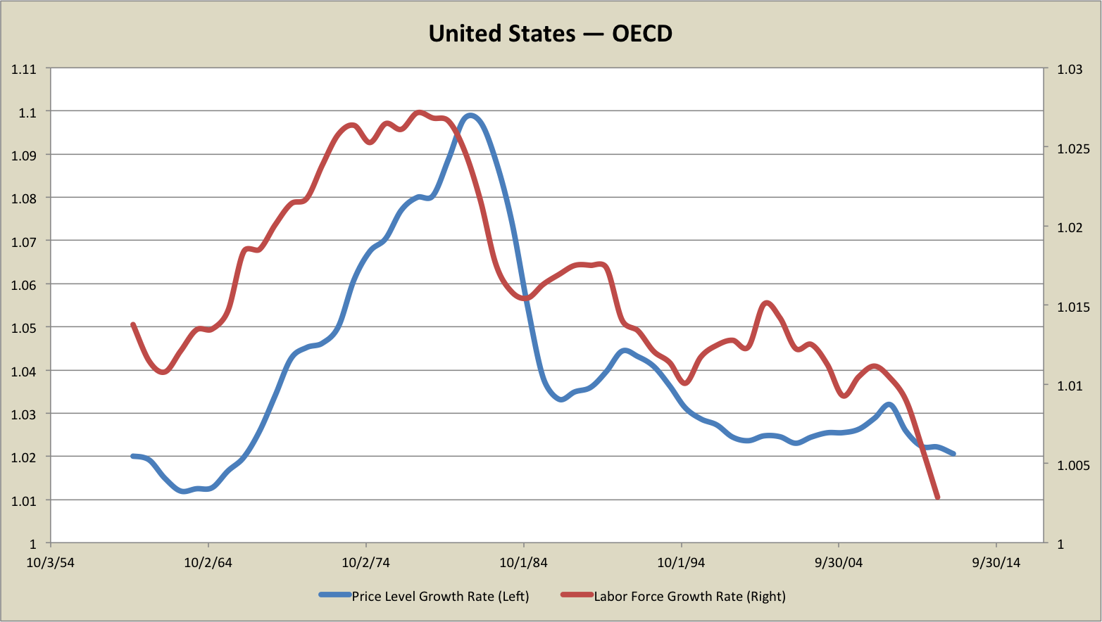
Without further ado, here is my base case, the United States:
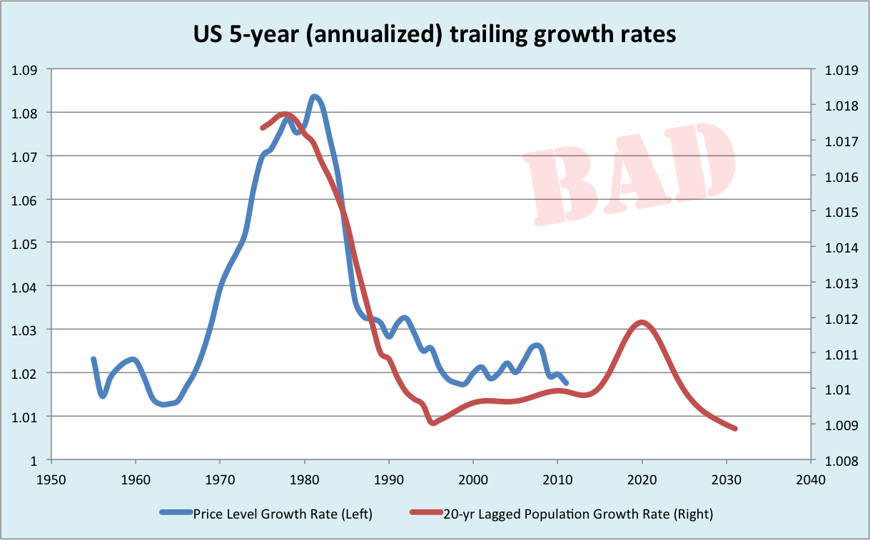
Unsurprisingly, as this is the economy from which I drew the thesis, it matches up pretty well.
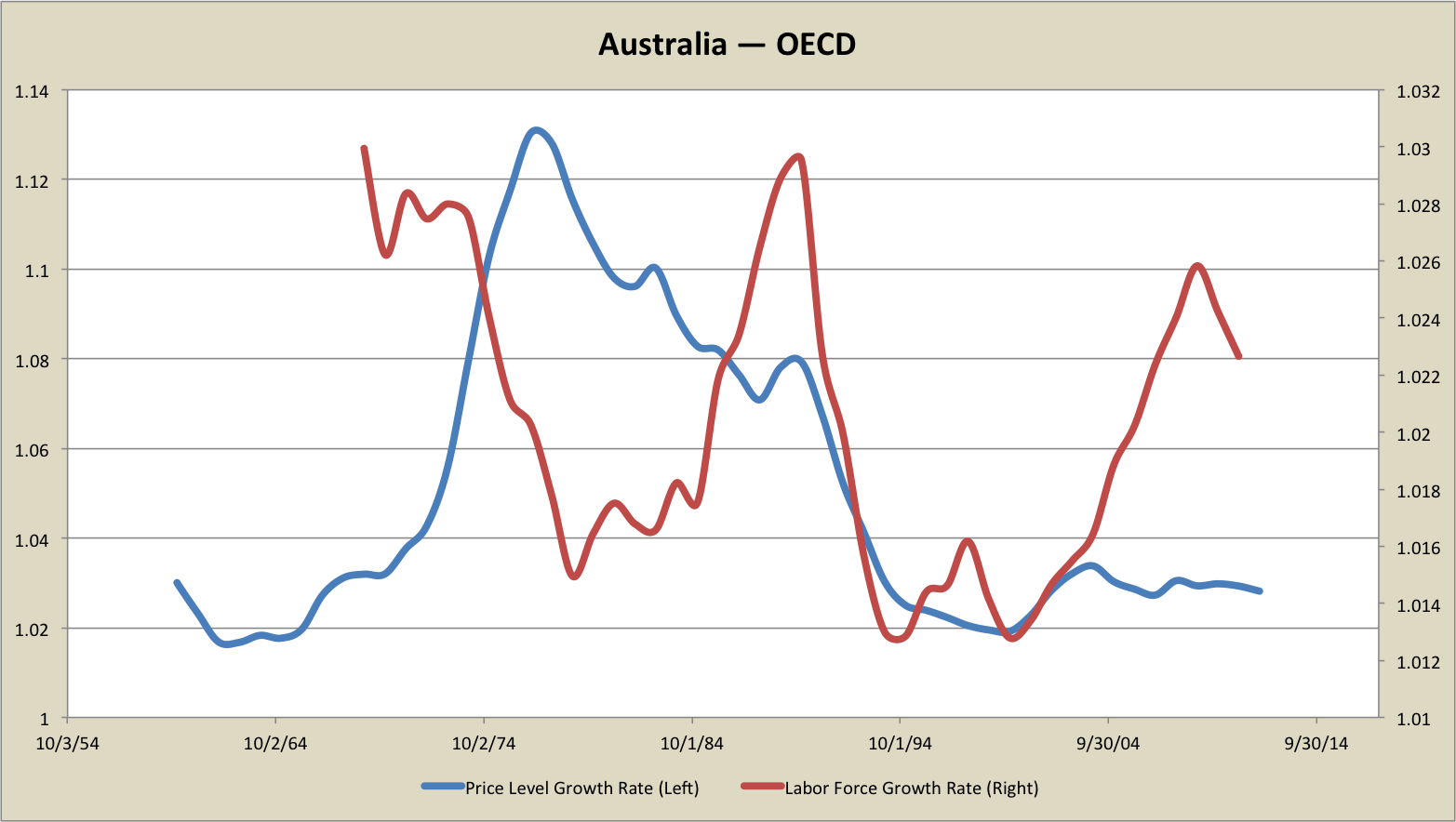
Let’s try Australia next:
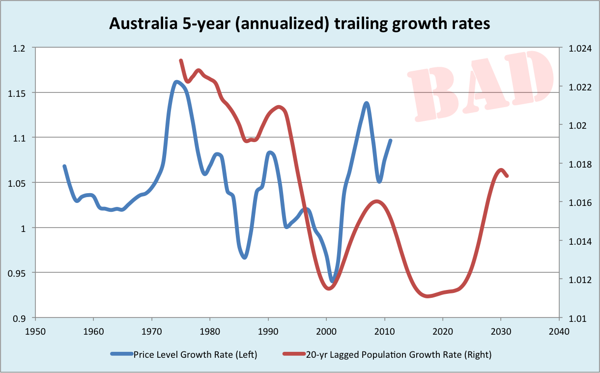
Again, to me, the smoothed inflation rate and population growth level follow one another during the disinflation rather strikingly. The inflation changes seem to lead the population growth rate changes a bit, which is somewhat surprising. But the population growth is 20-year lagged. Inflation in 1970 isn’t likely to be causing changes in the 1950s birthrate. Here, as in many of the graphs, I’m going to write off this lead of price changes off as due to some combination of an ill-chosen lag, missing effects of workforce composition changes, and forward-looking policymakers anticipating near-future entrants to the labor force. Reasonable or confirmation bias? You be the judge!
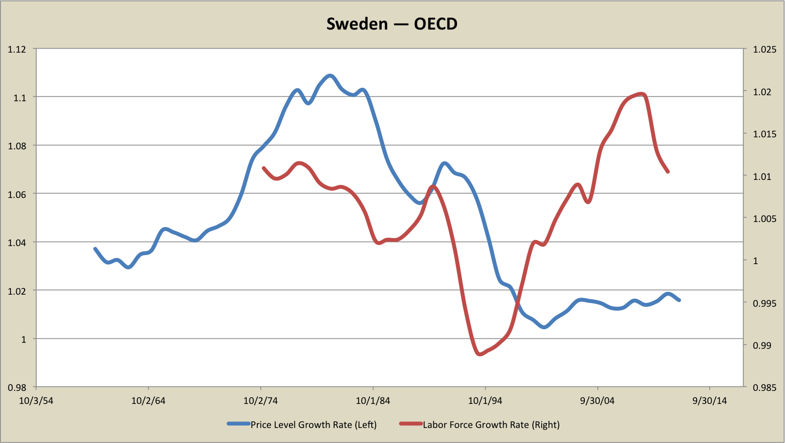
Next let’s look at Sweden.
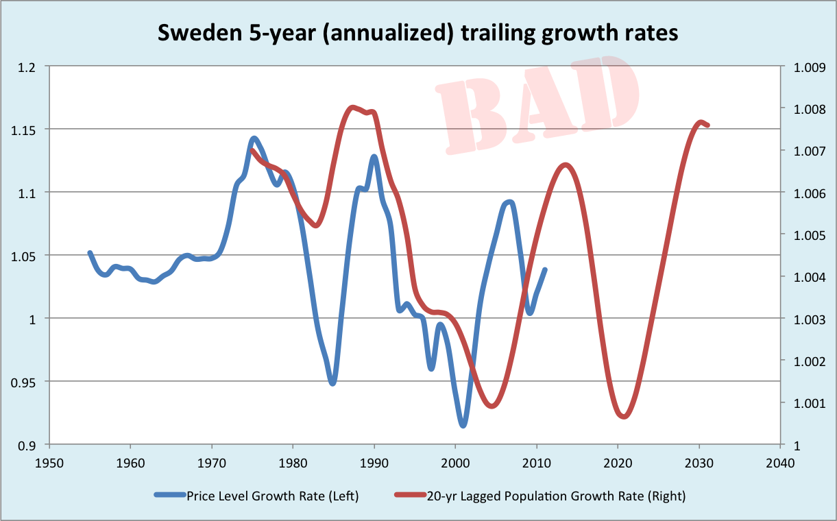
Sweden is one of four countries I looked at that Sadowski cited as a counterexample. But once you look at time series rather than individual data points, I think it’s okay. Again, the price level leads a bit, but otherwise the two series track one another fairly well.
The UK is the first country that contains a really interesting anomaly:
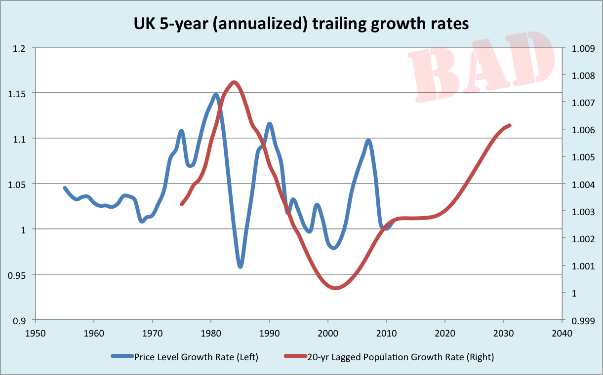
Note the downspike in inflation in the mid-1980s, entirely unmatched by any fall in population growth. I think this anomaly is very easy to explain, and very informative. Concomitant with the Volcker disinflation in the US, the Bank of England allowed interest rates to climb very high. Sure enough, tight money, killed inflation! But inflation seems to be very zombie-like when the labor force is rapidly growing! You can kill it, but unless you painfully hold it down, it comes right back. That was the US experience in the late 1960s and 1970’s: each attempt to tighten money (reflected in high interest rates) provoked a sharp bout of unemployment, until the Fed cried uncle. Was the problem insufficient grit and determination on the part of the Arthur Burns Fed? Or did Volcker get lucky, in that his tightening cycle happened to coincide with the peak growth rate of the US labor force? Maybe a bit of both? (I know we love to fight, but most hypotheses are not mutually exclusive!)
Anyway, the UK experience was very clear. There was a lot of grit and determination in the early 1980s, it was temporarily effective, but it didn’t take. The inflation zombie rose again. It was slain for good when, perhaps coincidentally, the lagged population growth rate collapsed.
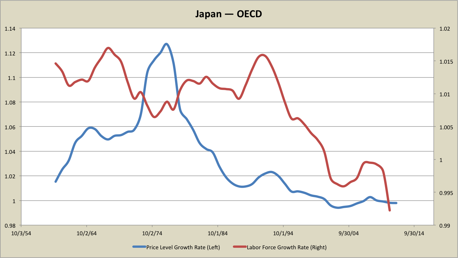
How about Japan:
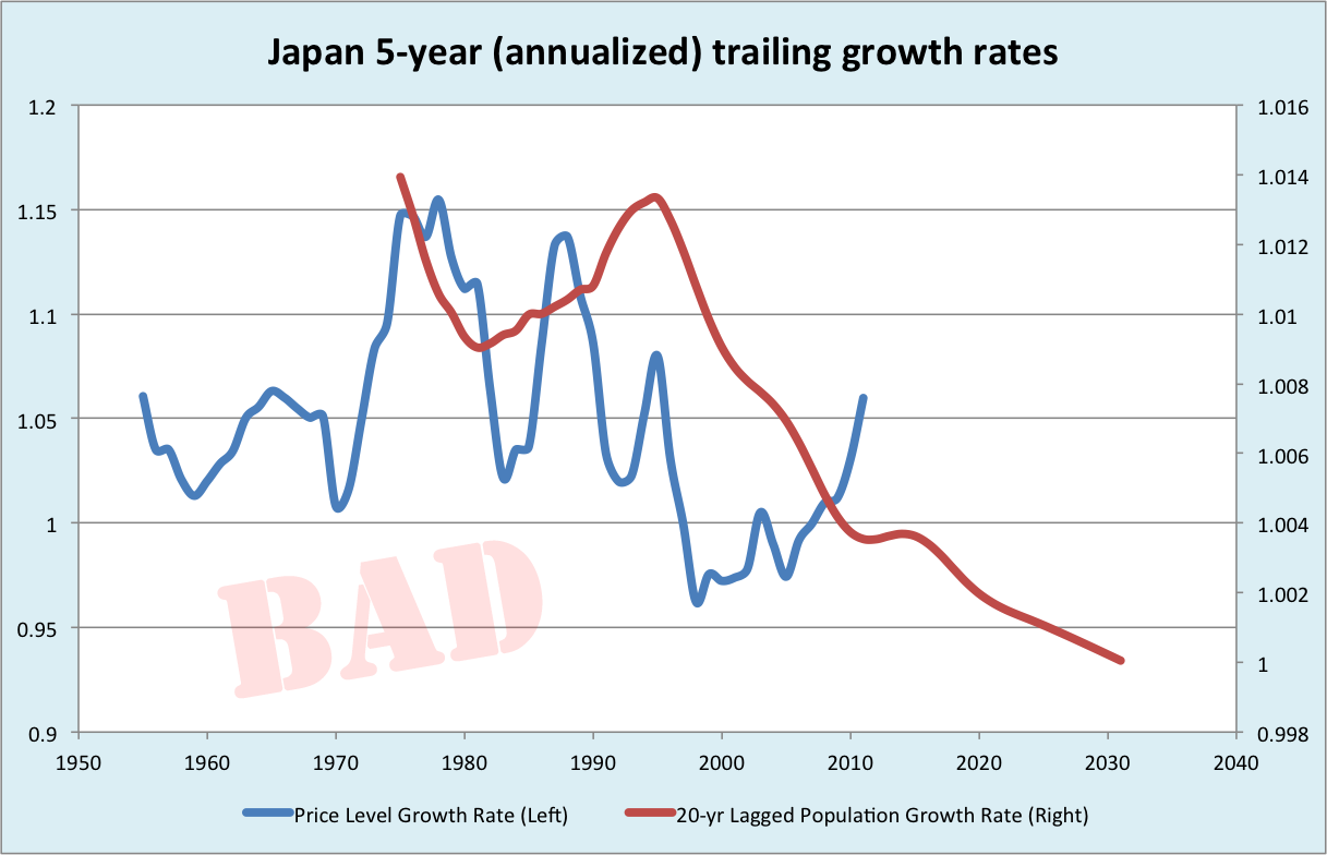
I don’t know what to say about Japan. In a general sense, the two series track. Population growth collapsed and the economy went into deflation. But the two series certainly don’t wiggle together in any obvious way. Totally a Rorschach Test.
Next let’s look at Austria.
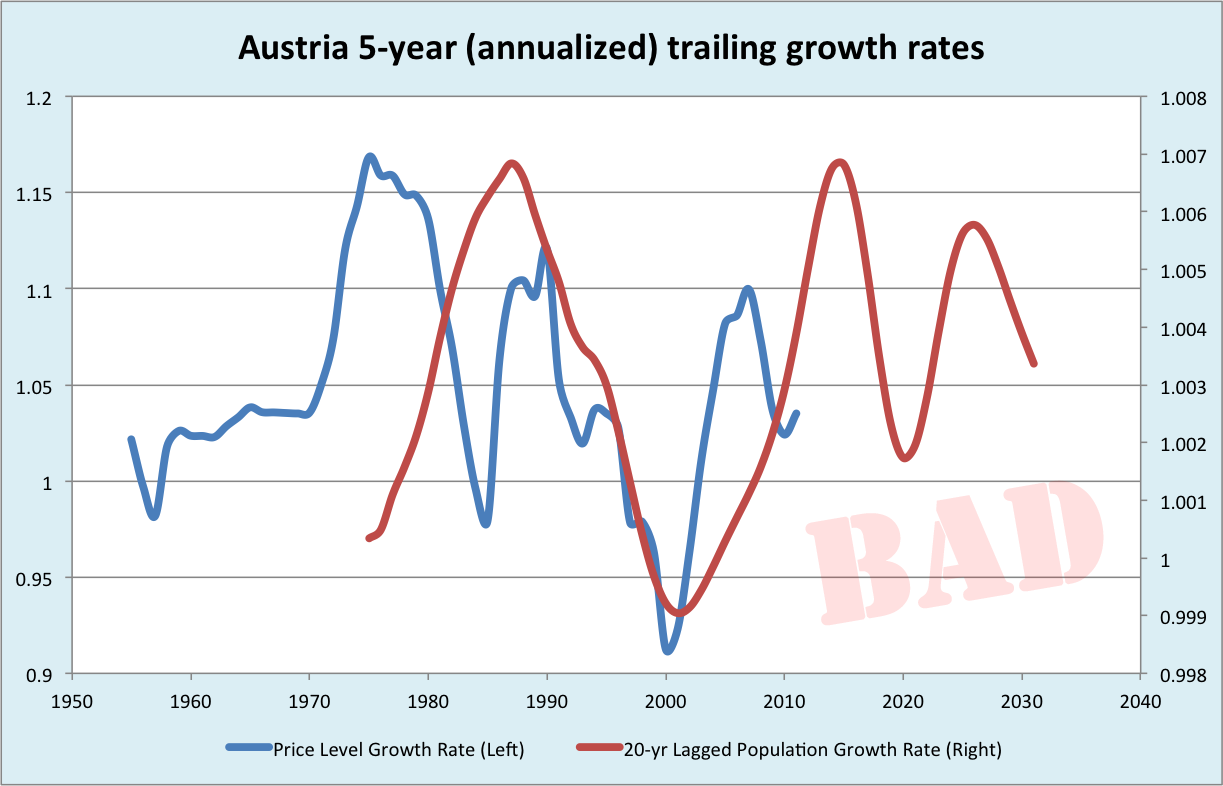
Again, you can call this one either way. On the one hand, Austria’s disinflation corresponded very well to a collapse of putative workforce growth. But the initial inflation did not. I could wave my hands about commodity prices and the Great Inflation being a global phenomenon, so that explains the early start. But you know, confirmation bias. You decide, I’ll call it a draw.
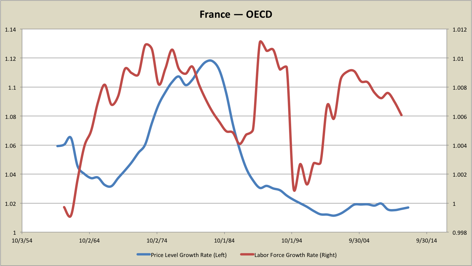
France graphs like the surprisingly sexy love child of the UK and Austria:
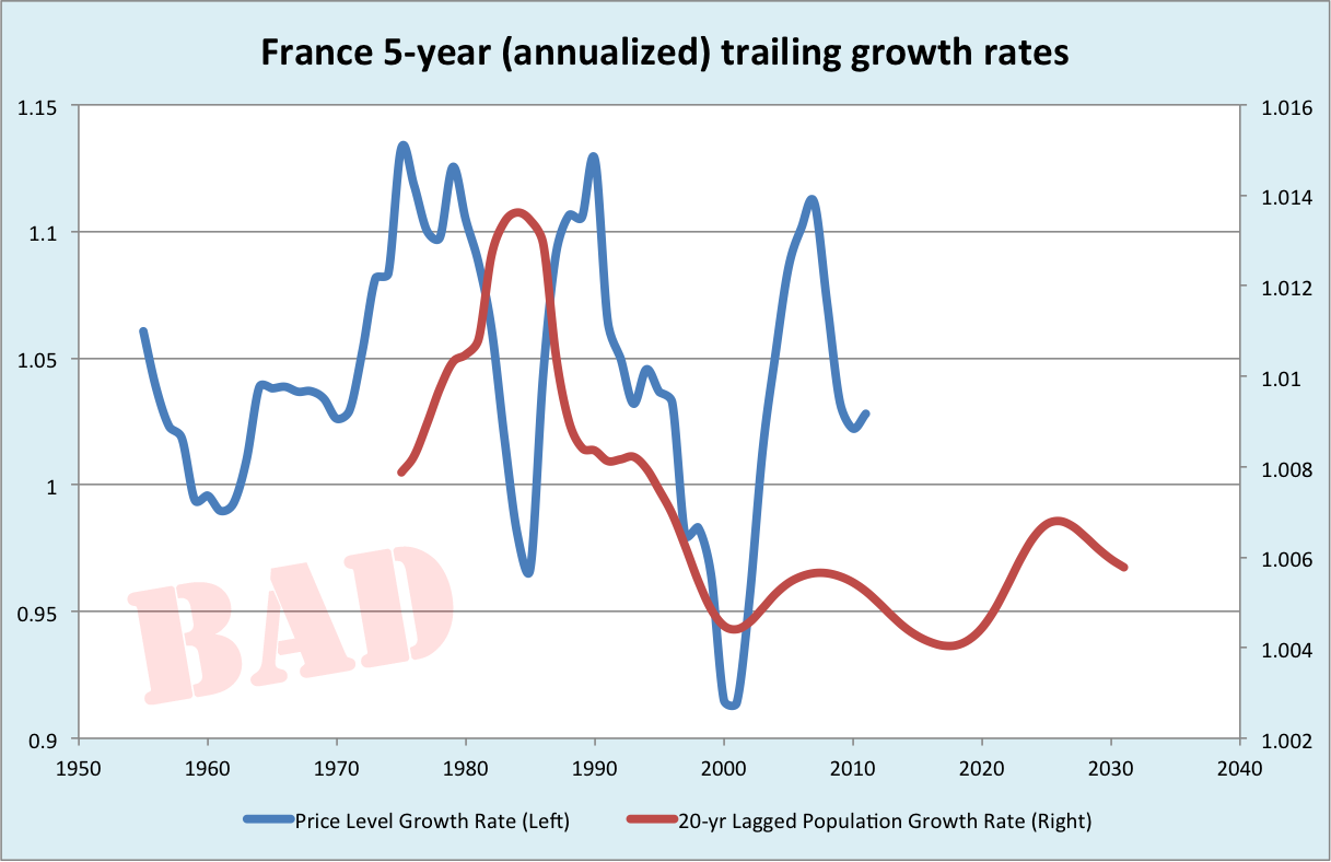
Like Austria, France suffered from embarrassing premature inflation. It did the job, though! Babies were conceived and born in the 20-year-lagged time machine, and eventually there was a nice boom of workforce entrants, timed to match the Volcker disinflation in the 1980s. As in the UK, there was a satisfying downspike then a zombie-like return of price level growth. Inflation then fell roughly — very roughly! — coincident with the decline in population growth. Like Austria, the nadir of the two series match very well but any comeandering of the rest is less clear. There is something interesting in the tail of the France graph. Post-2000, inflation rose sharply, in a manner that doesn’t seem at all proportionate to population growth. We’ll see there was a similar spike in Spain. (Also in Austria, but that did track population growth.) One explanation for these spikes would be post-Euro capital flows: Price level growth is often attributed to foreign lending, and both France and Spain were current account deficit nations. (Do foreign capital flows fall under the definition of a “monetary phenomenon”? You tell me!)
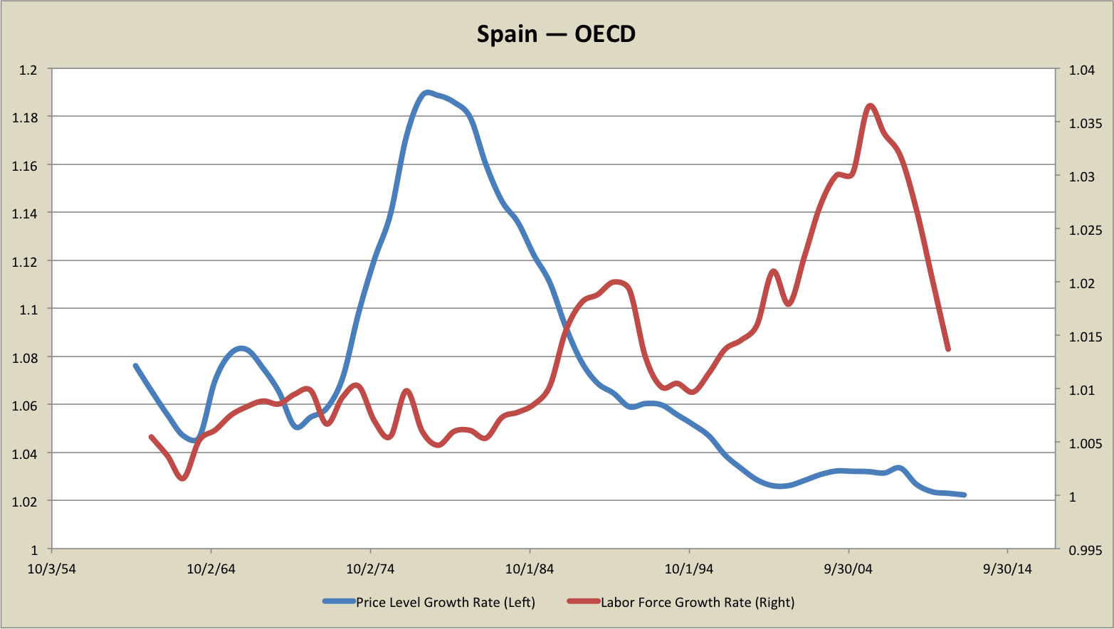
So, Spain. Let’s do Spain:
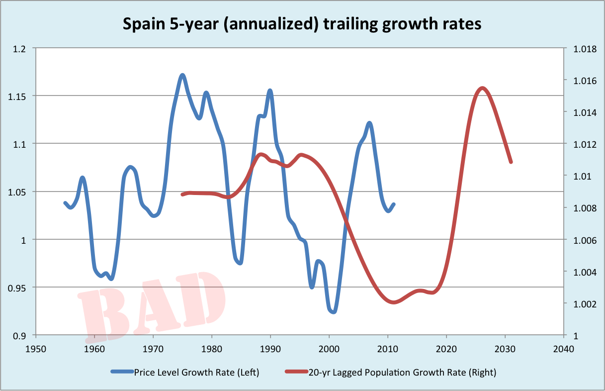
Of the countries I examined, Spain was the one that least fit my story. Spain disinflated before population growth collapsed, and reinflated just when it did. So Spain is a legitimate counterexample. I have my stories: There may have been unusual political will towards disinflation in the high population growth 1990s Spain, so the country could qualify for Euro entry. Once the Spain entered the Euro, it was a prime destination for speculative lending. The timing of these events was completely decoupled from Spain’s population dynamics.
But, confirmation bias is a real danger. I have to concede that, on face, Spain’s inflation dynamics looks nothing like I would expect from my demographic hypothesis.
Overall, I think my claim that labor force expansion imparts an inflationary bias is supported by these graphs. The Great Inflation and its unwind, I score four clear “wins”, three iffy cases, and one clear loss. These were the only countries I examined. (I’m not cherry picking from a larger group.)
Throughout the graphs, there are some recurring themes. Inflation downspikes in the 1980s are nearly universal, but they “take” as persistent disinflation only when ratified by falling labor force growth. The relationship between disinflation and slowing labor force growth seems more precise than the relationship between labor force growth and the initial inflation. Current account deficit countries (including the UK and Australia and Eurozone countries, but not the US) tended to experience inflation unrelated to population growth in the period following Y2K.
I think demographics has had a very great deal to do with inflation dynamics. My cards are on the table. Obviously this is imperfect evidence. So what do you think?
p.s. The messy spreadsheet from which these graphs were generated is here. R&R my ass — I screw this kind of thing up all the time.
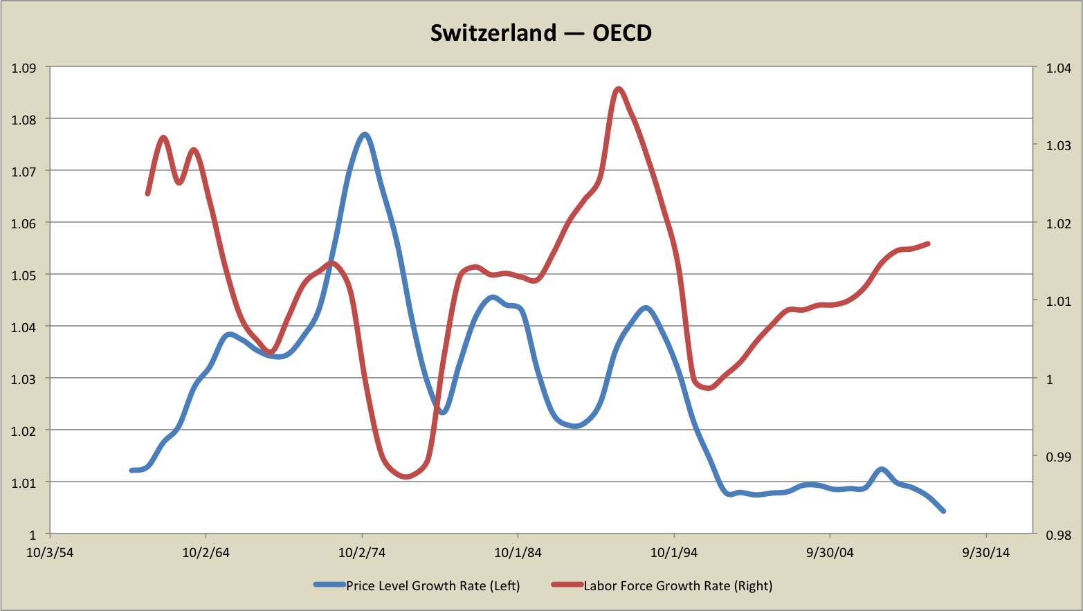
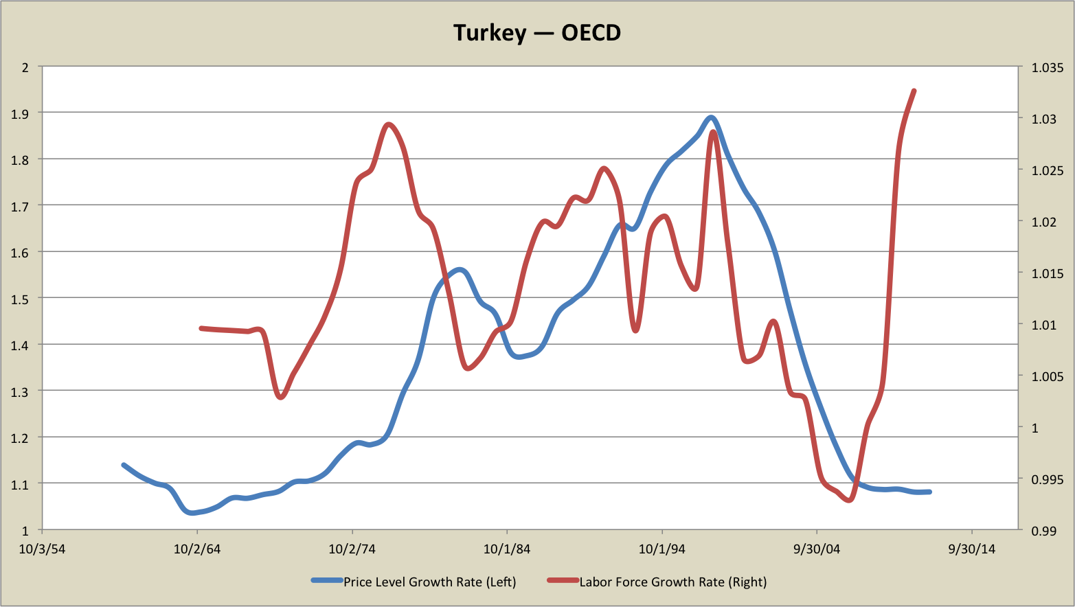
Appendix: Please see the update at the top of this post. The spreadsheet from which these new graphs were generated is here. These are graphs of 5-yr trailing growth rates, annualized. They are presented as gross rates, so that 1.2 means a 20% growth rate in more conventional terms.
Graphs from the original post, redone (corrected!):
[UK omitted, missing data]
[Austria omitted, missing data]
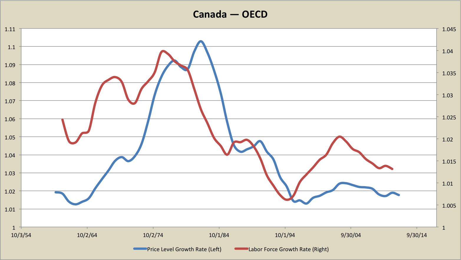
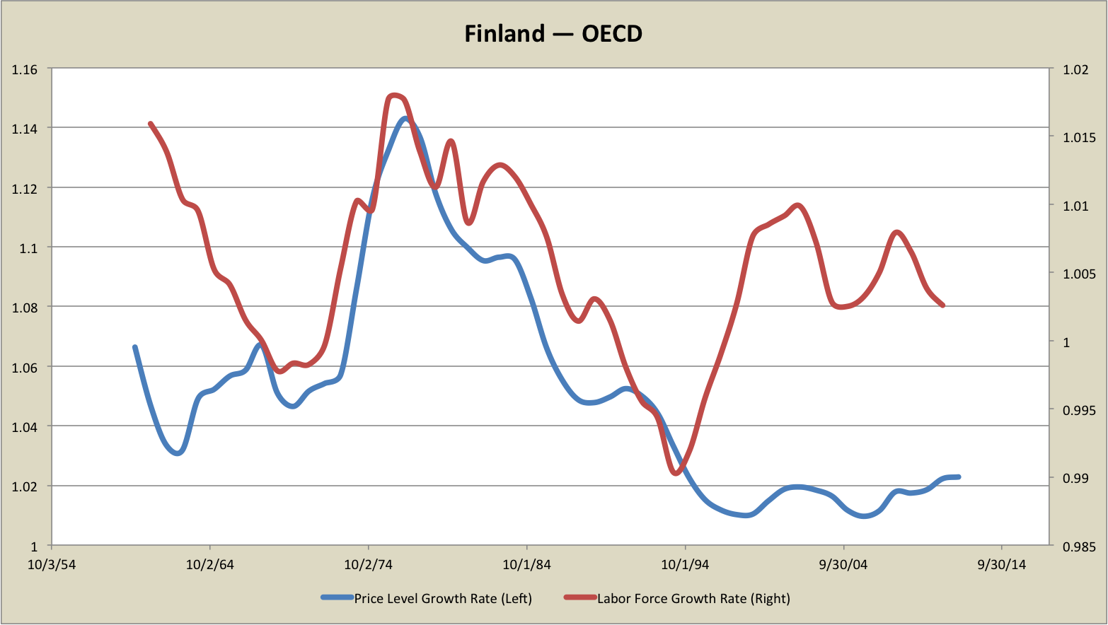
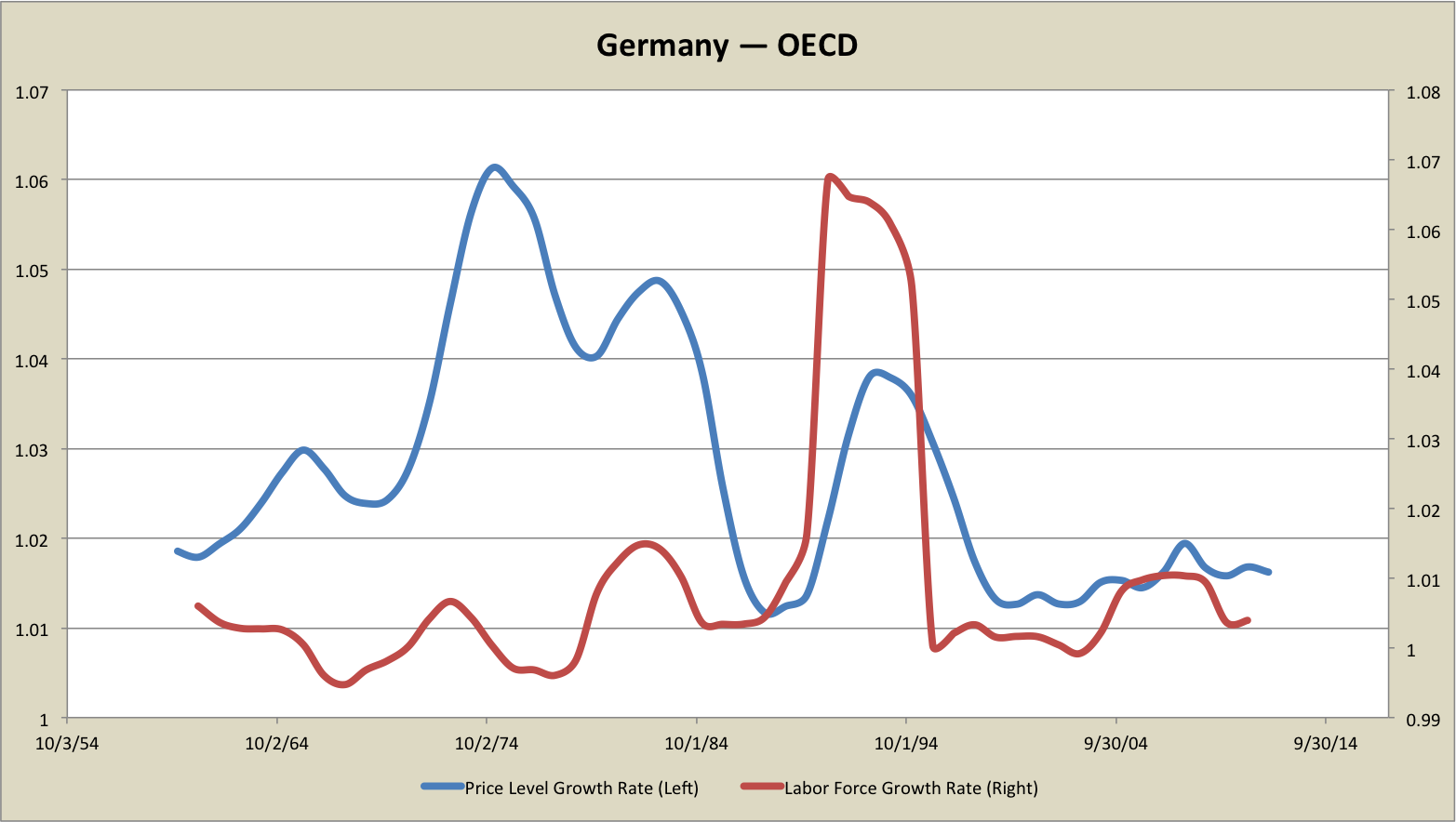
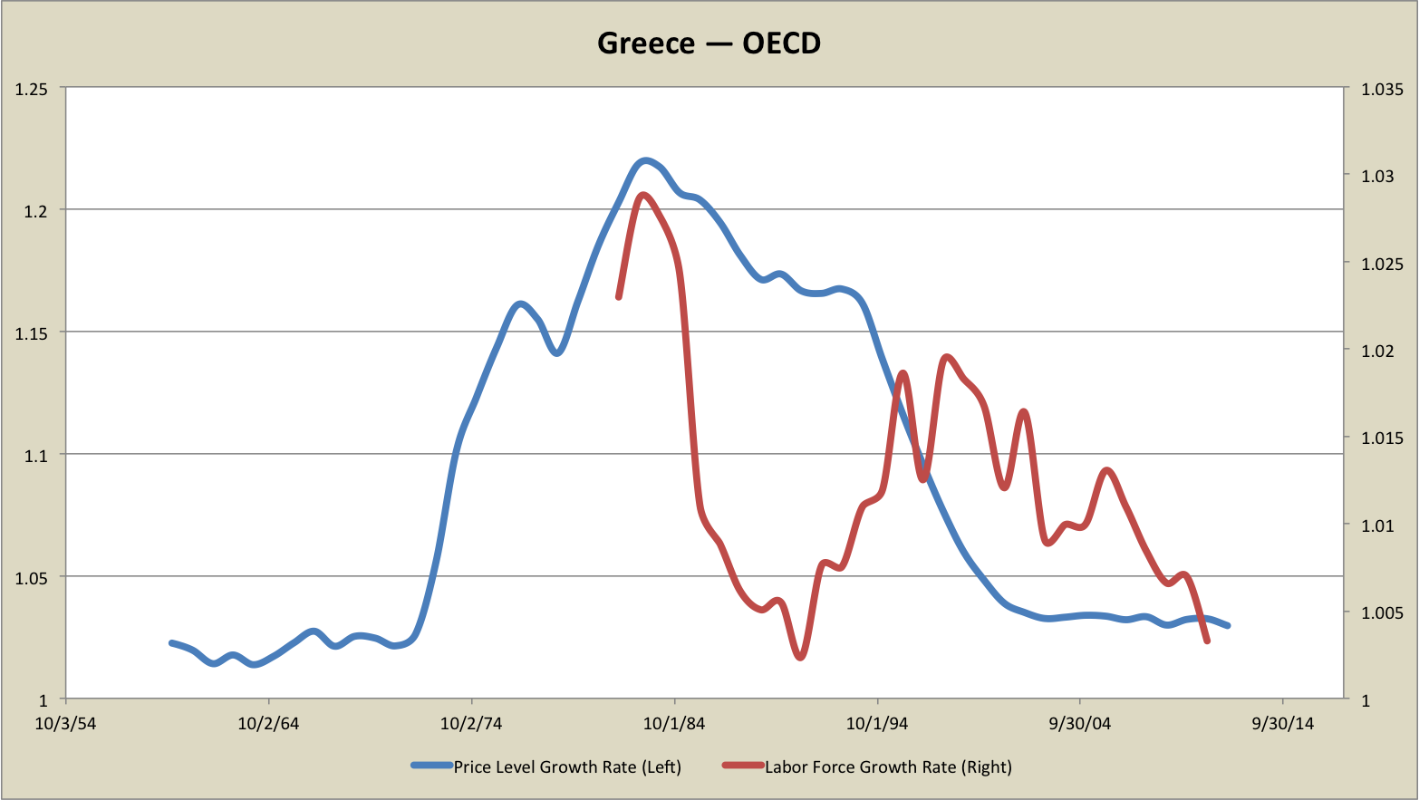
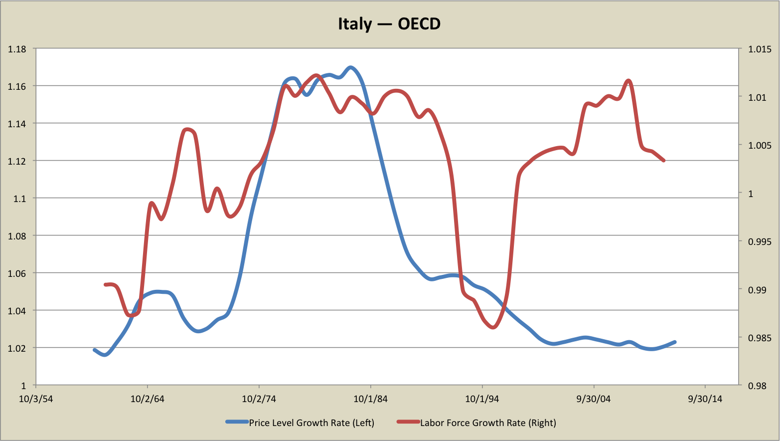
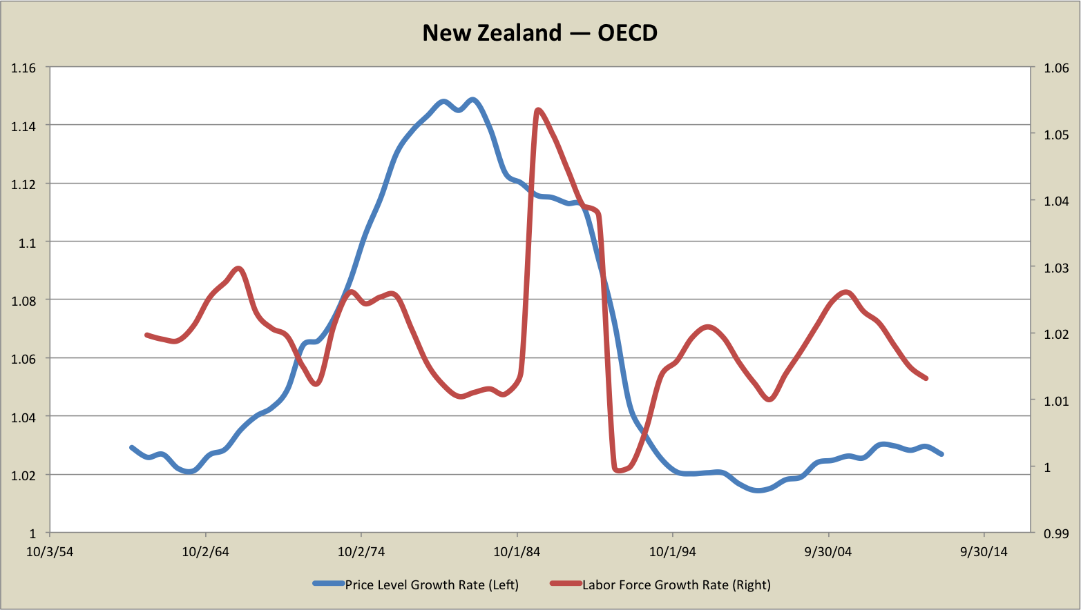
Other countries:
Update History:
- 8-Sept-2013, 8:30 a.m. PDT: Corrected name (twice) “
SandowskiSadowski“ - 9-Sept-2013, 1:40 a.m. PDT: Retraction via bold update at beginning of piece + strike-through of original, recomputed graphs with more appropriate data in the Appendix.
- 9-Sept-2013, 4:15 a.m. PDT: Added “BAD” watermarks to the original graphs.
- 11-Sept-2013, 10:00 p.m. PDT: “
totoo“
[…] Demographics and inflation: international graphs […]
September 8th, 2013 at 7:44 am PDT
link
[…] Demographics and inflation: international graphs […]
September 8th, 2013 at 7:45 am PDT
link
Steve,
There’s no “n” in “Sadowski”.
September 8th, 2013 at 9:32 am PDT
link
Just because the 70’s inflation was done on purpose by the monetary authority to overcome labor market issues doesn’t mean it wasn’t a monetary phenomenon I don’t think.
September 8th, 2013 at 9:59 am PDT
link
Population growth being lagged by 20 years misses immigration, in which adults who come to a country then compete for jobs immediately.
Pull the population growth forward in Western countries since 2000, since much of the population growth in Western countries comes from immigration (progressive politicians chose to increase immigration in order to distribute social services to the new immigrants, who would become a progressive vote bank). Notice that the curves fit better.
September 8th, 2013 at 12:04 pm PDT
link
Steve,
Right away I see two enormous problems.
1) Lagged population growth is a very poor proxy for labor force growth.
This is especially evident in the case of Spain and the UK where bursts in labor force growth in from the late 1990s to late 2000s have been driven by foreigners. This is also especially true of two other of my counterexamples: Ireland and Luxembourg. In short lagged population growth is a very poor proxy for labor force growth for these countries.
2) The Penn World Tables consumer price inflation data appears to be hugely flawed.
Remember a burst of double digit inflation across the advanced world in the oughts? Of course not.
According to the Penn World Tables the average consumer price inflation rates from 2002-07 for Australia, Austria, France, Spain, Sweden and the UK were 13.7%, 10.0%, 11.2%, 12.1%, 9.0% and 9.7% respectively. According to the OECD the actual average CPI inflation rates from 2002-07 for Australia (13.7%), Austria (10.0%), France (11.2%), Spain (12.1%), Sweden (9.0%) and the UK (9.7%) were only 2.3%, 1.5%, 1.6%, 2.6%, 0.6% and 1.4% respectively.
This is even more ridiculous in the case of Japan. The Penn Tables claim Japan’s average inflation rate from 2006 to 2011 was 6.0%. The actual CPI inflation rate was of course (-0.5%).
September 8th, 2013 at 12:06 pm PDT
link
Oops. I forgot to edit out the rates in parenthesis. Just ignore them.
September 8th, 2013 at 12:08 pm PDT
link
Steve,
While you’re chewing on that, consider the following.
Lorenzo from Oz pointed out something I wasn’t even thinking about. US labor force growth was even higher in the 19th century. For labor force estimates from before 1890 I turned to the following:
http://www.sciencedirect.com/science/article/pii/0164070494900086
For civilian labor force estimates after 1890 the Millenial edition of the US Statistical Abstract is probably the most authoritative. Between the two it appears ten year labor force growth rates in the US exceeded the 1969-79 level in 1869-79 through 1887-97. The peak level during this period is 1870-80 when labor force increased by 38.2%.
According to MeasuringWorth the CPI and the GDP implict price deflator both declined at an average rate of 2.41% from 1870-80.
In short the period of maximum US labor force growth coincides with a period of extreme deflation.
Now, was there a depression during the 1870s? Sort of.
There was a very long recession from 1873-78 and according to J. R. Vernon’s estimates national unemployment more than doubled from 4.0% to 8.3% in a time when the country was still very agrarian. But he also estimates that the unemployment rate was only 4.5% in 1880 compared to 3.5% in 1870.
Now, mind you, I think labor markets were much more flexible in those days so deflation did far less harm. But if your story is that demographics drives inflation rates and not monetary policy, surely this fact alone would cause you to reexamine your beliefs.
September 8th, 2013 at 12:39 pm PDT
link
Inflation is always and everywhere a political phenomenon. Politics is more complicated than population growth.
September 8th, 2013 at 12:55 pm PDT
link
Steve,
On closer examination I think I see what the problem with the Penn World Table data is.
The consumer price data you are using is measured relative to the US GDP implicit price deflator. That’s why you see such wild gyrations. Exchange rate fluctuations are causing this effect. Offhand I don’t see how to convert this into useful inflation data.
I would recommend using civilian labor force data from the OECD (available all the way back to 1955/56). You can get CPI (national) at AMECO for all of these countries back to 1960.
September 8th, 2013 at 1:51 pm PDT
link
Fascinating discussion. I’ve always found the discussion of the 1970s inflationary period lacking. Personally it was ahead of my time economically speaking as I was only a kid. I do remember candy jumping in price from a nickle to 25 cents.
Perhaps “Morning in America” did not kick off more inflation, as Volcker lowered rates again, was because as was suggested Reagan broke PATCO, Japan came online and the demographic goat was through the snake? It wasn’t just all a matter of Volcker?
September 8th, 2013 at 3:54 pm PDT
link
Steve,
I took your set of eight nations plus the four from my original set of counterexamples that you excluded (West Germany, Ireland, Luxembourg and the Netherlands), combined civilian labor force data from the OECD with CPI from AMECO, and computed 5-year compounded average civilian labor force growth rates and CPI inflation rates. The time periods ran from 1960-65 through 2007-12.
Then I regressed the average CPI inflation rates upon the average labor force growth rates. Five of the twelve were statistically significant, and all at the 1% level. The average civilian labor force growth rate and average CPI inflation rate were positively correlated in the U.S. and Japan, and negatively correlated in Spain, the Netherlands and Luxembourg.
Next I conducted Granger causality tests using the Toda and Yamamato method on the level data over 1960-2012 for the U.S., Japan, Spain, the Netherlands and Luxembourg.
The U.S. data is cointegrated, so although the majority of lag length criteria suggested using only one lag, since Granger causality in both directions was rejected at a length of one, I went to two lags based on the other criteria. The results are that CPI Granger causes civilian labor force at the 10% significance level but civilian labor force does not Granger cause CPI.
In Japan’s case civilian labor force Granger causes CPI at the 1% significance level but CPI does not Granger cause civilian labor force.
Granger causality was rejected in both directions for the other three countries.
In short, out of the 12 countries I looked at, only five have a significant correlation between average civilian labor force growth and average CPI inflation, and only two of five have a positive correlation. Of the five, only the two with positive correlation demonstrate Granger causality. But in the US case the direction of causality is in the opposite direction to that which you predict. Only Japan seems to support the kind of story you are trying to tell.
September 8th, 2013 at 10:04 pm PDT
link
[…] Interfluidity has some interesting speculations on demography and rates of price inflation. Karl Smith offers related […]
September 9th, 2013 at 3:42 am PDT
link
[…] Interfluidity has some interesting speculations on demography and rates of price inflation. Karl Smith offers related […]
September 9th, 2013 at 4:16 am PDT
link
[…] <追記>Interfluidityが人口動態とインフレ率との関係について興味深い考察を行っている。 カール・スミス(Karl Smith)のコメント(こちらとこちら)もあわせて参照あれ。 […]
September 9th, 2013 at 5:40 am PDT
link
Steve,
I added your set of seven new nations (Canada, Finland, Greece, Italy, New Zealand, Switzerland and Turkey) plus seven additional nations (Belgium, Denmark, Iceland, Korea, Norway, Poland and Portugal) to the set of 12 that I commented on last time. I did the same analysis as I did last time for this new set of 14, that is I combined civilian labor force data from the OECD with CPI from AMECO, and computed 5-year compounded average civilian labor force growth rates and CPI inflation rates. The time periods ran from 1960-65 through 2007-12 with the exception of Korea which started with 1967-72. I regressed the average CPI inflation rates upon the average labor force growth rates. Ten of the fourteen were statistically significant, and all at the 1% level with the exception of Poland which was at the 10% significance level. The average civilian labor force growth rate and average CPI inflation rate were positively correlated in Canada, Denmark, Finland, Greece, Iceland, Italy, Korea, New Zealand and Norway and negatively correlated in Poland.
Next I conducted Granger causality tests using the Toda and Yamamato method on the level data over 1960-2012 (except for Korea which was over 1967-2012) for the ten countries which had statistically significant correlations.
In Finland, Poland and Korea civilian labor force Granger causes CPI at the 5% significance level but CPI does not Granger cause civilian labor force. In Greece CPI Granger causes civilian labor force at the 1% significance level but civilian labor force does not Granger cause CPI. In Iceland CPI Granger causes civilian labor force at the 10% significance level but civilian labor force does not Granger cause CPI.
So out of the 26 countries I have looked at, fifteen have a significant correlation between average civilian labor force growth and average CPI inflation with eleven of the fifteen having a positive correlation. Of the eleven with positive correlation six demonstrate Granger causality with three showing one way causality from civilian labor force to CPI and three showing one way causality from CPI to civilian labor force. Of the four with negative correlation one demonstrates Granger causality from civilian labor force to CPI.
Only three countries (Japan, Korea and Finland) out of the 26 support the kind of story you are trying to tell.
September 9th, 2013 at 6:32 pm PDT
link
You’re not plotting unemployment. I thought the point you were originally making was that there is a tradeoff between unemployment and inflation in the face of a large influx of young workers, and that the trade off chosen in the US in the 1970’s was a reasonably good one overall. Leaving out unemployment means that these charts are missing the point. Perhaps at certain times many countries did avoid inflation at the expense of unemployment while at other times they avoided unemployment at the expense of inflation, but without unemployment data you can’t tell.
In reality there is a lot of work to sort out which data to use. There are various measures of unemployment – do you use the official unemployment rates even though calculation methods have changed over time, underemployment rate, or hours worked by the workforce per week/number of workers times 40? With workforce changes do you use the change in the overall size of the workforce, or the flow of young workers into the workforce, or a ratio of young workers to old workers? There are also choices about inflation – CPI, GDP deflator, PCE deflator, WPI, (some of these include changes in sales taxes, others not) although I think that these alternatives would not lead to such different results as the various indicators of workforce size, or unemployment. Then you have choices in the time frame over which to average the data.
You need to choose the data sets that corresponds to the proposition you are interested in testing. For example, if you think that lots of young workers leads to lots of loans and that a shortage of older workers willing to hold the debt leads to an expansion of money supply and thereby inflation, then you’d lean towards a ratio of young workers to old workers. If you think that the number of old workers is irrelevant and the loans are what matters, then you’d lean towards just using the percentage change in young workers. If you think that the issue is just more workers than can be usefully employed by businesses, then you’d be leaning towards using rate of change in workforce size. There are lots of propositions that involve inflows of workers, usage of workers and inflation.
September 9th, 2013 at 7:57 pm PDT
link
IMF working paper (kind of) supporting the point made in this post:
http://www.imf.org/external/pubs/cat/longres.aspx?sk=40916.0
September 9th, 2013 at 11:28 pm PDT
link
SRW,
Inflation rises when real output growth slows down at the LRAS curve as determined by the effective demand limit. Yet, we need to assume there is money feeding demand before and during a recession.
Real output growth can increase from a rise in the labor force. If money isn’t there to match the increase in real output, we could see deflation as Mark points to the data in the 1800’s. All of a sudden you have more workers sharing the money supply. Deflation seems like a natural consequence. So the question arises, Is monetary policy going to lead to inflation or deflation when there is a surge in the labor force?
In the 1970’s, there was an increase in the money supply that was absorbed in the real output growth which was partly due to the baby-boomers entering the labor force. So the money supply had to feed that real output growth and the extra workers. And we did not see rising inflation between the recessions. Real output growth was absorbing the money. But when the effective demand limit constrained real output before the recessions, the money for demand got translated into inflation, not real output.
Inflation is not solely a monetary phenomenon. The dynamics of the constraint upon real output also have a role.
If you look at the history of inflation, it peaks around recessions, where the effective demand limit is constraining output, re-directing demand into higher prices and wages.
http://research.stlouisfed.org/fredgraph.png?g=mgy
However, the rising tide of baby-boomers added to the surge that lifted inflation up high to over 11% during those recessions of the 1970’s.
We don’t see a labor force surge behind the inflation now. What money makes it into the economy now gets absorbed by spare capacity and some real output growth. I think SRW is bringing in an important factor underlying inflation potential, and for that matter, deflation potential, as seen in the 1800’s.
September 10th, 2013 at 1:45 pm PDT
link
Right here is the perfect web site for anybody who would
like to find out about this topic. You understand a whole lot its almost hard to argue with you (not that I actually will need to…HaHa).
You certainly put a brand new spin on a topic which has been written about for ages.
Wonderful stuff, just wonderful!
September 18th, 2013 at 8:20 am PDT
link
It is exacting that you posted something like this and I am rather auspicious to understand it. Thanks seeking posting this!
Parajumpers Jackets Outlet http://www.parajumperspjss.com/
September 21st, 2013 at 9:34 pm PDT
link