Steve Randy Waldman
@interfluidity.com
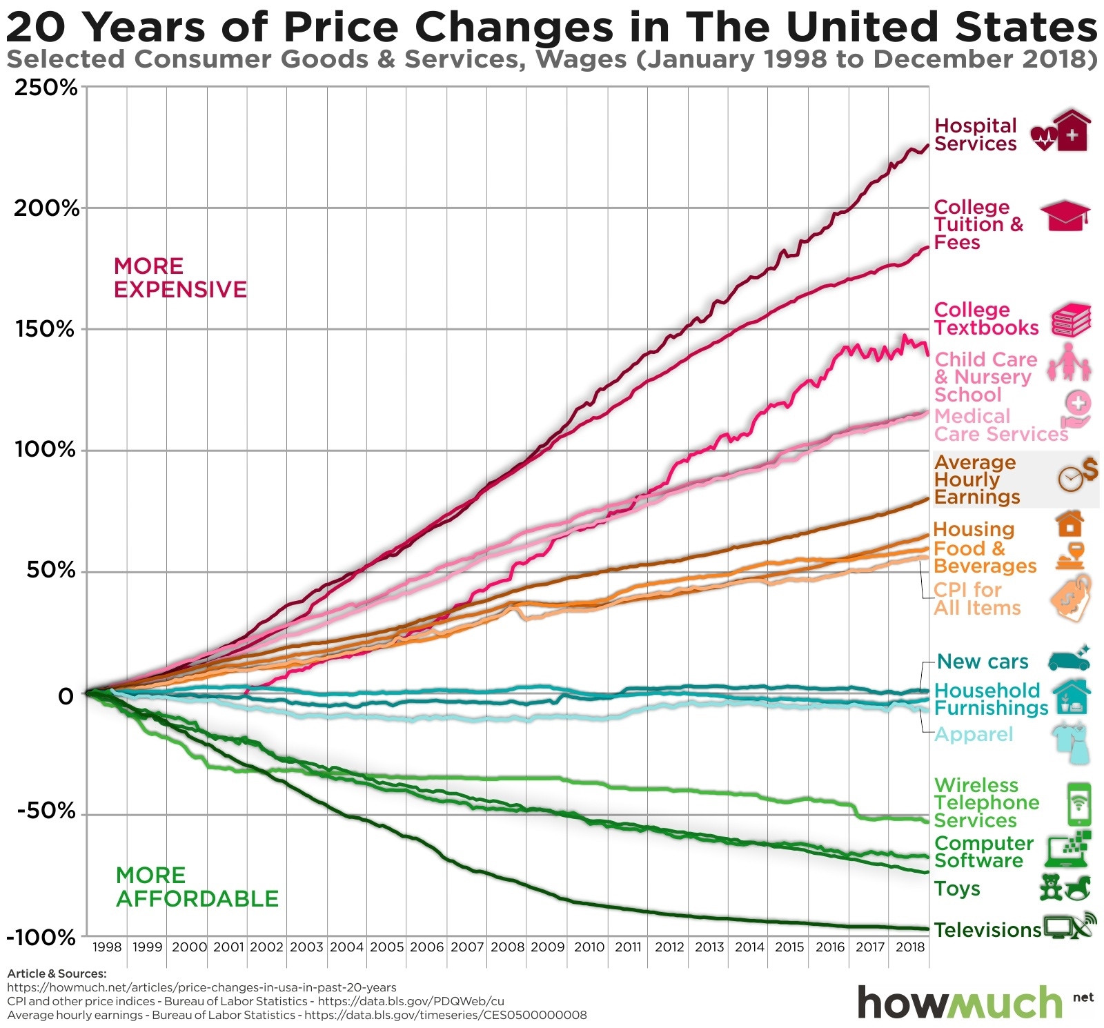
(most of those are visible in the official stats, if arguably understated. a more current version of the chart below would show a sharp increase in housing since 2018, and that would from most people’s perspective be understated, given how housing quality along social dimensions has stratified.)
Steve Randy Waldman
@interfluidity.com
(in the piece, my goal was to use the measure the more rose-colored side of the debate seems to prefer, and show that the terms on which they are using it — absolute level higher than ever! — is not really informative of whether the economy is good or bad.)
Steve Randy Waldman
@interfluidity.com
(whatever information is in these series — and i agree it’s a lot more problematic than naive “real purchasing power” intuitions suggest — is in the changes, not the levels.)
Steve Randy Waldman
@interfluidity.com
( i did a post on why levels are uninformative here drafts.interfluidity.com/2025/11/12/r... )